DRAG DROP
You are developing a web page that will be accessed from various types of devices.
• You have the following requirements:
• The appropriate display resolution must be selected dynamically based on the device that is connecting to the page.
• Mobile devices with a maximum width of 480 pixels must be able to use the page.
You need to ensure that the page displays correctly on any device.
How should you build the code? (To answer, drag the appropriate media statement to the correct location. Each media statement may be used once, more than once, or not at all. You may need to drag the split bar between panes or scroll to view content.)
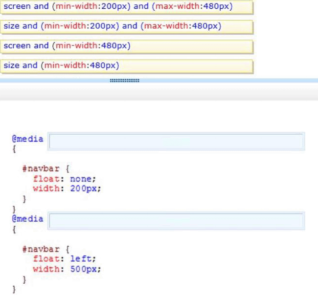
Answer: 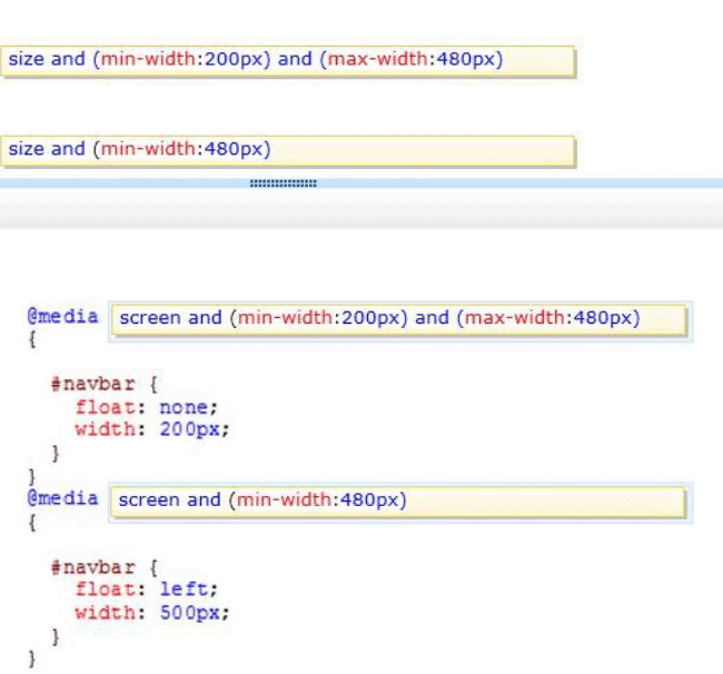
Explanation:
* The @media rule is used to define different style rules for different media types/devices.
CSS Syntax
@media not|only mediatype and (media feature) {
CSS-Code;
}
* Media type: Screen
Used for computer screens.
Incorrect:
Not size: there is no media type size.
Reference: CSS3 @media Rule; CSS Media Types
Latest 70-480 Dumps Valid Version with 288 Q&As
Latest And Valid Q&A | Instant Download | Once Fail, Full Refund
