You have a Power Bl report that contains the visual shown in the following exhibit.
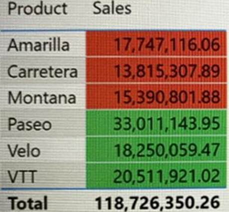
You need to make the visual more accessible to users who have color vision deficiency.
What should you do?
A . Change the font color of values in the Sales column to white.
B . Change the red background color to orange.
C . Add icons to represent the sales status of each product.
D . Add additional measures to the table values.
Answer: A
Explanation:
Themes, contrast and colorblind-friendly colors
You should ensure that your reports have enough contrast between text and any background colors. Certain color combinations are particularly difficult for users with color vision deficiencies to distinguish.
These include the following combinations:
**—> green and black
green and red
green and brown
blue and purple
green and blue
light green and yellow
blue and grey
green and grey
Avoid using these colors together in a chart, or on the same report page.
Reference: https://docs.microsoft.com/en-us/power-bi/create-reports/desktop-accessibility-creating-reports
Latest DP-500 Practice Questions with 83 Q&As
Updated Study Material | Instant Download | Detailed Answers and Explanations