HOTSPOT
You are using Azure Synapse Studio to explore a dataset that contains data about taxi trips.
You need to create a chart that will show the total trip distance according to the number of passengers as shown in the following exhibit.
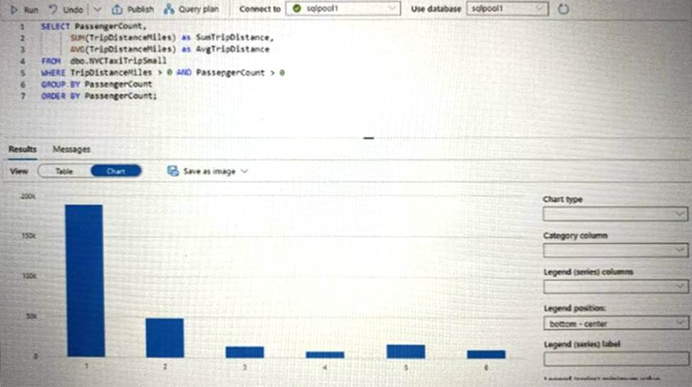
How should you configure the chart? To answer, select the appropriate options in the answer area. NOTE: Each correct selection is worth one point.
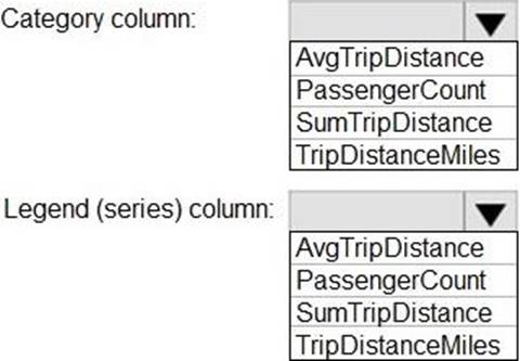
Answer: 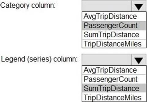
Latest DP-500 Practice Questions with 83 Q&As
Updated Study Material | Instant Download | Detailed Answers and Explanations