You need to create a visualization that compares revenue and cost over time.
Which type of visualization should you use?
A . stacked area chart
B . donut chart
C . line chart
D . waterfall chart
Answer: C
Explanation:
A line chart or line graph displays the evolution of one or several numeric variables. Data points are connected by straight line segments. A line chart is often used to visualize a trend in data over intervals of time C a time series C thus the line is often drawn chronologically.
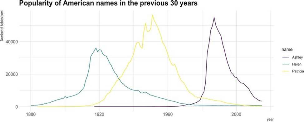
Example:
Incorrect Answers:
A: Stacked area charts are not appropriate to study the evolution of each individual group: it is very hard to substract the height of other groups at each time point.
Note: A stacked area chart is the extension of a basic area chart. It displays the evolution of the value of several groups on the same graphic. The values of each group are displayed on top of each other, what allows to check on the same figure the evolution of both the total of a numeric variable, and the importance of each group.
Reference: https://www.data-to-viz.com/graph/line.html
Latest PL-300 Practice Questions with 131 Q&As
Updated Study Material | Instant Download | Detailed Answers and Explanations