How can you make the pie chart (shown in the attached graphic) display correctly?
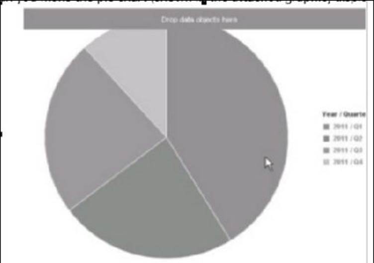
A . Change to the Design – With Data application mode.
B. Drag a measure on to the chart
C. Change to the Reading application mode.
D. Drag a dimension or attribute on to the chart
Answer: B
Latest C_BOWI_4302 Dumps Valid Version with 218 Q&As
Latest And Valid Q&A | Instant Download | Once Fail, Full Refund
